What's wrong with the brand one and its CTs is:
Anyway, despite its flaws and confirmed incorrect measurements that are off by more than 2% and not in a consistent fashion (I tried to derive an error per day or kwh, but it was all over the map, from 2kwh short per day to overcounting during the winter. I think part of the problem is that the CTs are too big and pick up too much noise in the case of the solar panel probe.
Anyway, the PV system had its own counter and reported 8566Kwh for that period of time while the powermeter measured 8260Kwh (a bit over 5% off).
This graph and the graphs below are selected in zoom mode, so you can use the mouse cursor to draw a rectangle on a time region and the graph will refresh on the time slice you selected. Note that you can also zoom out by clicking the graph with the right button:
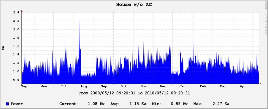
House Power without AC, you can guess which day was our wedding day :)
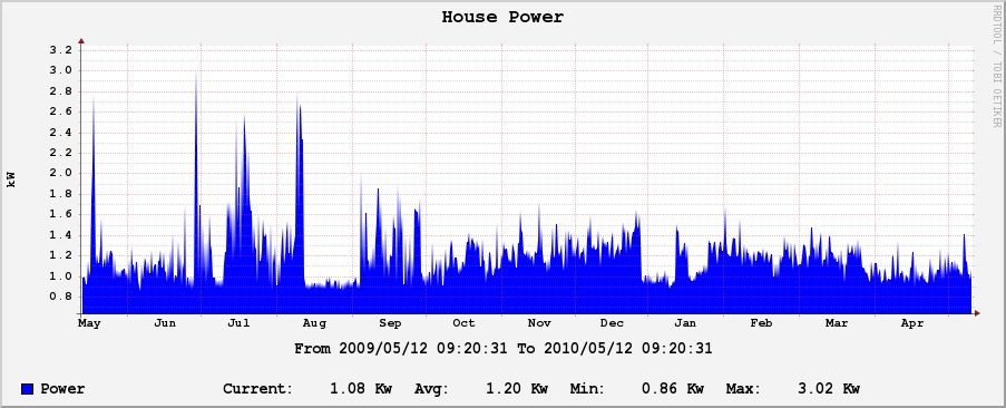
House Power
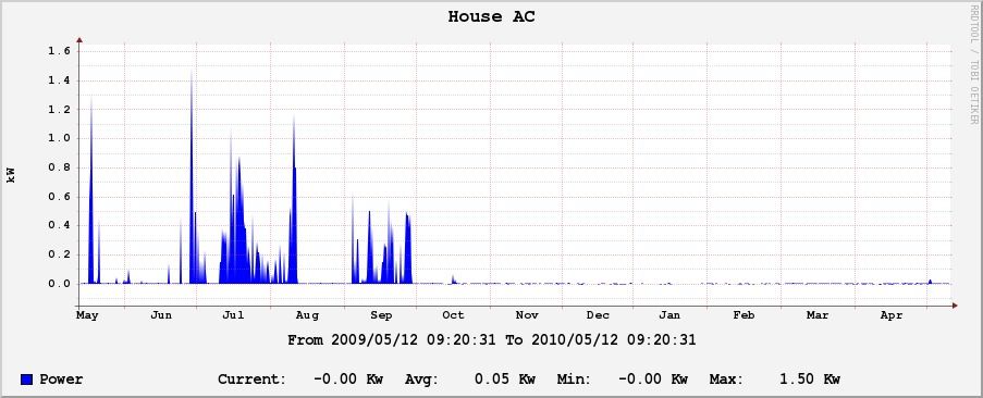
AC doesn't look like much, but it still comes in handy 6 months a year:
Photovoltaic production looks pretty good, even during the better winter days:
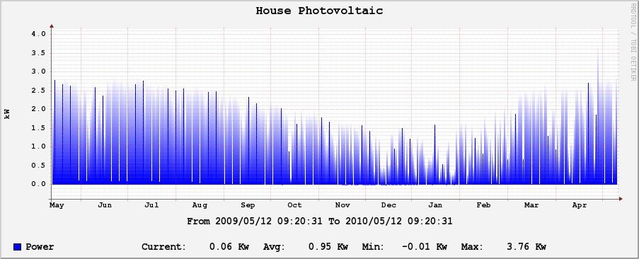
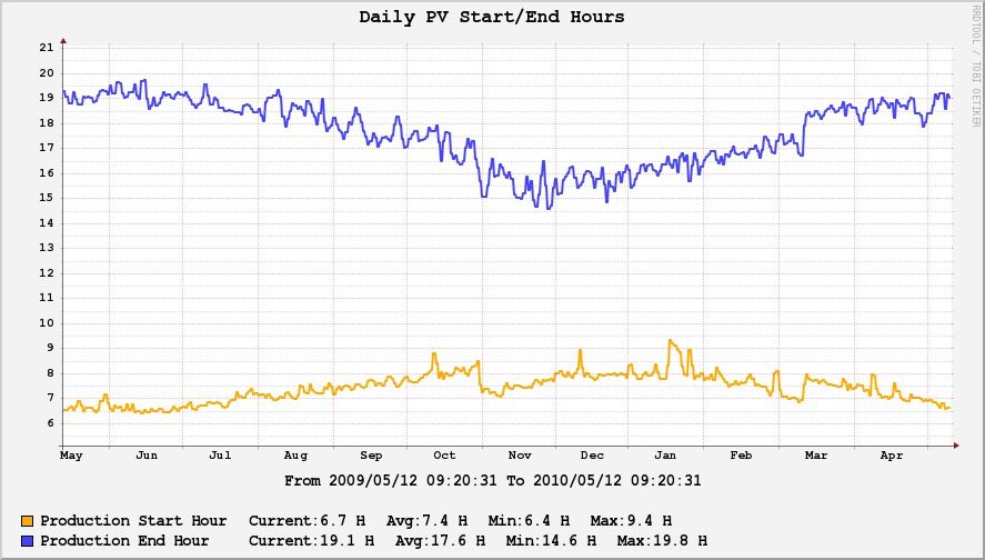
Also, the daily production start and end (hour the sun starts hitting the panels and when it sets past the roof while the end hour can be a bit early because of trees on the west of our roof). Note the one hour jump on Nov 1st and March 6th because of the daily savings change:
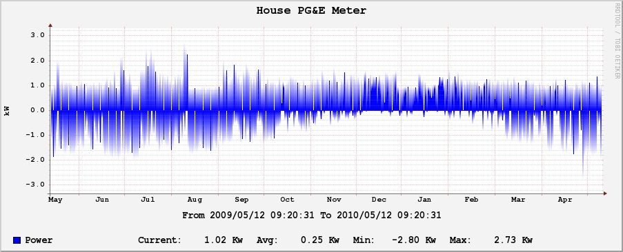
And the interesting part is the PG&E Meter. 0.25Kwh average is 2170Kwh/year, but due to time of use our bill is actually slightly negative:
Anyway, even if the scientist in me is quite bothered by the inaccuracy of the Brand One Powermeter (the data being over 5% off is just no good), it's still good enough for nice trend graphs and seeing the results one year later.